
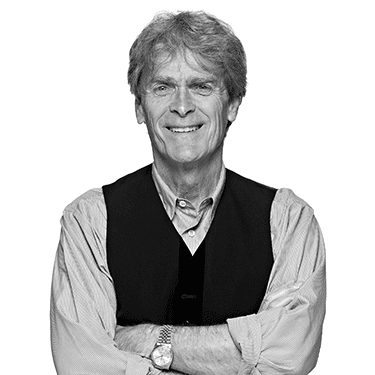
Each week we ask our esteemed guests to name their favourite billboard. For our 100th episode we’ve compiled their choices to form the Behind the Billboard 100, a definitive list of the greatest OOH of all time. What will be No.1? The Economist, a campaign that’s dominated adland and our podcast alike? Or maybe Survival Billboard for X-Box? A campaign that turned a poster into a gaming platform. Or perhaps it’ll be a good old-fashioned special build with a car glued to a billboard for Araldite from the 1980’s? All will be revealed by Hugh, Dan and ad legend Sir John Hegarty who very kindly joined us on episode #100.

BEANZ MEANZ HEINZ Where better to start than with a slogan. And not just any old slogan, but possibly the most famous of the lot. Three words, a rhythmic triplet, completely centred around the product. The iconic “Beanz Meanz Heinz” slogan was created in 1967 by Maurice Drake, a copywriter and later head of copy at Young & Rubicam. He famously conceived the simple, rhyming phrase after a couple of pints in The Victoria pub. The original campaign aimed to position Heinz as the definitive brand of baked beans. It became an enduring success, later voted the “Best Advertising Slogan Of All Time”. The phrase proved so effective Heinz even changed its packaging to “Heinz Beanz” to match the slogan, which continues to be a cornerstone of the brand’s identity decades later. //// CREDITS: Title: Beanz Meanz Heinz Client: H J Heinz Agency: Young & Rubicam Copywriter: Mo Drake Art Director: Jean Bird Photographer: Tony Copeland

DRINKA PINTA MILKA DAY Another worthy contender, “Drinka pinta milka day” was prominent on billboards from the late 1950s to the 1970s. The campaign was created for the British Milk Marketing Board and the Dairy Council by W.S. Crawford (which later became part of Ogilvy & Mather). The phrase – coined by Bertrand Whitehead in 1958 – made playful use of “incorrect” spelling to reflect spoken English, a creative decision that helped embed the term “pinta” into the British vernacular to describe a pint of milk. //// CREDITS: Title: Drinka Pinta Milka Day Client: National Milk Publicity Council Agency: Mather & Crowther Copywriter: Bertrand Whitehead

YOUR COUNTRY NEEDS YOU A defining image from wartime Britain, “Your country needs you,” was originally designed by British graphic artist Alfred Leete and has been reproduced countless times in various formats. It first appeared on the cover of the popular weekly magazine London Opinion on September 5, 1914, just after the outbreak of the First World War. The illustration features Field Marshal Lord Kitchener, the then Secretary of State for War, staring and pointing directly at the viewer in a compelling call to enlist in the British Army. The original image was later adapted into an official recruitment poster by the Parliamentary Recruiting Committee, and while its initial impact as a mass-produced poster might be less than commonly believed, its powerful design and psychological impact have made it one of the most famous and enduring images of the 20th century. //// CREDITS: Artist: Alfred Leete Subject: Lord Kitchener, British Secretary State for War Original source: The image first appeared on the cover of London Opinion in September 1914. Poster production: The Parliamentary Recruiting Committee used image to create iconic recruitment poster. Printer: One version of the poster was printed by Victoria House Printing Co. Ltd., London

CRESTA – IT’S FROTHY MAN It’s John Webster man. Yet another campaign of creative brilliance from one of our greatest copywriters. The 1970s Cresta work, featuring a cool, sunglasses-wearing cartoon polar bear whose demeanor would shift to one of ecstatic enthusiasm upon drinking the beverage, was the brainchild of Webster. The bear’s widely quoted catchphrase, “It’s Frothy, Man!,” became instantly memorable. The successful campaign, which included both tv commercials and billboards, is often cited as a prime example of how creativity can elevate a product, making the mascot even more famous than the drink itself. Such a shame we never had John on the show, but his work lives on. //// CREDITS: Title: It’s frothy man Client: Cresta Agency: Boase Massimi Pollitt (BMP) Copywriter: John Webster Illustrator: Richard Williams Studios

THE HANS BRINKER BUDGET HOTEL The Hans Brinker Budget Hotel’s celebrated campaign, ran for over two decades, adopting a strategy of brutal honesty, positioning itself as “the world’s worst hotel”. The campaign highlighted the hotel’s unapologetic lack of amenities and poor service. The unconventional and highly effective “anti-ad” approach was created by Amsterdam-based KesselsKramer, which took on the hotel as one of its first clients in 1996. //// CREDITS: Agency: KesselsKramer Client: Hans Brinker Budget Hotel Creative Director: Erik Kessels Art Directors: Maartje Slijpen, Stephanie Luscher, Krista Rozema, Gijs van den Berg, Erik Kessels Copywriters: Sophie Rijnaard, Christian Bunyan, Niek Eijsbouts, Johan Kramer, Tyler Whisnand Photographer/Illustrator: Jan Dirk van den Burg, Anthony Burrill, Jaap Stahlie

B&Q – WE WILL GROW AGAIN The B&Q ‘We will grow again’ campaign ran in the aftermath of COVID to celebrate the resilience and re-emergence of the UK from the winter lockdown, offering a message of hope as spring arrived. The stunning visuals were shot by the renowned photographer Dan Tobin Smith. //// CREDITS: Title: We will grow again Client: B&Q Agency: Uncommon Creative Studio Photographer & director: Dan Tobin Smith Floral stylist: Carla Gottlieb Retouch on stills: PICS

RAWLINGS – WE KNEW HOW, BEFORE YOU-KNOW-WHO This wry billboard from the 1970s was created to position the brand as the original tonic water, while taking a gentle swipe at market leader, Schweppes. The campaign was created at the esteemed London agency Collett Dickenson Pearce (CDP), where the late, great Ron Collins served as the primary copywriter and creative force behind the work. //// CREDITS: Title: We knew how … Agency: Collett Dickenson Pearce Copywriter: Ron Collins


ABSOLUT Sometimes you just need to take a moment and look at the product. Maybe the answer is there, right in front of you. The distinctive shape of the Absolut Vodka bottle literally became the idea when TBWA\Chiat\Day art director Geoff Hayes had the thought whilst taking a long soak in the bath. The concept led to the debut ad “Absolut Perfection” in 1980. The campaign’s success was then driven forward by the creatives ability to produce over 1,500 variations on the simple theme, eventually incorporating work from artists like Andy Warhol and Keith Haring. //// CREDITS: Title: Absolut Client: The Absolut Company Agency: TBWA Creative Director: Carol Ann Fine Art Director: Geoff Hayes Photographer: Steve Bronstein


PRUDENTIAL – I WANT TO BE The “I want to be” campaign was created by WCRS and aimed to shed the company’s old-fashioned “Man from the Pru” image. The billboards used the medium as the message, with every idea working in context, even creating a fake holiday poster where the other poster wanted to be. //// CREDITS: Title: Throws at me / Ends meet Other poster / Reduced / Straighten out Client: Prudential Agency: WCRS Creative Director: Alan Tilby Copywriter: Gary Knight Art Director: Andy Dibb Typographer: Kim Le Liboux

NCDL – TOYS AREN’T US The National Canine Defence League (now known as Dogs Trust) produced the impactful “Toys Aren’t Us” billboard in 1995, subverting the then widely recognised name of the “Toys ‘R’ Us” retail chain to deliver a powerful message about the responsibility of dog ownership. Trevor Beattie and TBWA at their very best in the great outdoors. //// CREDITS: Title: Toys aren’t us Agency: TBWA\ London Brand: National Canine Defence League Creative Director: Trevor Beattie Copywriter: Trevor Beattie Typographer: Tivy Davies Art Director: Steve Chetham Photographer: Samantha Leon

PLAYSTATION – IN YOUR BLOOD A great idea, given even more kudos when you know the blood in question belonged to the copywriter who came up with the idea, Graham Fink. Fink literally gave blood for the campaign, having a sample taken at a hospital and prepared on a slide. He then photographed the blood under a high-powered microscope and digitally retouched in the PlayStation symbols, resulting in a minimalist but striking image. //// CREDITS: Title: In Your Blood Client: Sony PlayStation Agency: TBWA, London Creative Director: Trevor Beattie Art Director: Graham Fink (who donated his own blood for the image) Photographer: Graham Fink


NISSAN MICRA – BUBBLE CAR At the time it was unheard of to run an advertising campaign for a car without featuring the car itself. So it was a brave client who bought the Nissan Micra “bubble car” work. The campaign utilized a simple, child-like graphic style with yellow visuals and black felt-tip pen. This design highlighted the new Micra’s compact, rounded shape and imply an environmentally astute, small urban runabout, contrasting how the car looked from the outside with the surprisingly spacious feel inside. //// CREDITS: Title: Car / Hammer / Cats Client: Nissan Agency: TBWA HKR Creative Director: Trevor Beattie Copywriter: Trevor Beattie Art Director: Steve Chatham Typographer: Tivy Davies Illustrator: Steve Chatham

KEEP CALM AND CARRY ON A slogan that for a while adorned everyone’s wall in the early 2000s. “Keep Calm and Carry On” was originally a piece of motivational propaganda produced by the British government in 1939, intended to boost morale during the widely anticipated mass air attacks of the Second World War. Designed by Ernest Wallcousins, the striking red and white poster, featuring a Tudor Crown symbol, was printed in huge numbers (around 2.45 million copies) but was ultimately held in “cold storage” as the expected immediate onslaught (the “Phoney War”) failed to materialise. Deemed potentially patronising to the public, most copies were later pulped due to paper shortages, meaning it was rarely publicly displayed as a billboard or poster during the war itself. The slogan only achieved its now-famous position in the public imagination after a copy was rediscovered in a bookshop in Alnwick, Northumberland, in 2000, leading to its mass reproduction and commercialisation as a symbol of British stoicism in the 21st century. //// CREDITS: The original “Keep Calm and Carry On” poster was the result of a collaboration within the British government’s Ministry of Information in 1939, and the design is credited to the British illustrator Ernest Wallcousins. Key individuals and entities involved in its creation: Ministry of Information (MOI): The government department responsible for the poster as part of a series of three morale-boosting propaganda posters at the outbreak of the Second World War. Ernest Wallcousins: The artist tasked with the graphic design of the posters, including the distinctive hand-drawn lettering and the use of the Tudor Crown symbol at the top. Civil Servants and Planners: A committee of civil servants and advertising agents, including A.P. Waterfield, William Surrey Dane, and Gervas Huxley, were involved in coining the slogan and planning the overall publicity campaign. Samuel Hoare: The Home Secretary at the time, who officially agreed on the final designs in August 1939. The poster was never officially issued for public display during the war and remained largely unknown until it was rediscovered in 2000 by Stuart and Mary Manley, the owners of Barter Books in Alnwick, who then popularised it through reproductions.

PIRELLI – POWER IS NOTHING WITHOUT CONTROL Here’s an idea. Carl Lewis in his running gear, but instead of wearing spikes that normally propel him to 100m in 9.86 seconds, we put him in a pair of size 12 red stilettos with the headline ’Power is nothing without control’. Oh and let’s insist on getting legendary photographer Annie Leibovitz to shoot it. That’s roughly the chat between Ewan Paterson and then partner Graham Norways, when creating the seminal poster for Pirelli tyres. Lewis wasn’t even an ambassador for the brand at the time. He was an unsuspecting ten-time Olympian minding his own business until someone asked if he was up for it. The image went on to become a legendary piece of advertising, winning every award going and even appeared in the book Annie Leibovitz: Photographs, 1970–1990. //// CREDITS: Title Red High Heels Client: Pirelli Agency: Young & Rubicam Creative Director: Mike Cozens Copywriter: Ewan Patterson Art Director: Graham Norways Photographer: Annie Leibovitz

NIKE – ARSENA In 2003-04 Arsenal become the only team in Premier League history to go an entire season unbeaten. To commemorate the occasion, Wieden+Kennedy London created an ad that featured the teams results that season, which would never have an ‘L’ in it. However when it was spotted the last letter of Arsenal was an ‘L’ the idea literally fell into their laps, hence we have a poster with the headline ‘ARSENA’ which Google will repeatedly try to correct to spell ARSENAL. //// CREDITS: Title: Arsena Client: Nike Agency: Wieden+Kennedy UK Creative Director: Tony Davidson / Kim Papworth Art Director: Guy Moore Copywriter: Tony Malcolm Typographer: Dan Broad

LWT The LWT billboard campaign from GGT (Gold Greenlees Trott) in the early 1980’s is a case study in creative thinking on every level. The actual ideas were brilliant – great copywriting, eye-catching visuals, all with a point of view upon culture and the political landscape. The trouble was at the time billboards couldn’t be changed fast enough to keep up with the advertising ideas being pumped out by the GGT creative department. The print lead times were weeks long, proving a challenge. To get around this challenge the agency created an ingenious printing method that produced the illusion of a weekly full-colour campaign. They pre-printed permanent colour elements (border/logo) and then each week only needed to print a single black plate for the central image, dramatically speeding up the process. This dynamic and cost-effective method enabled LWT to create the impression of a massive, fast-paced promotional effort using limited advertising space, much to the confusion of their competitors. This ingenious method was the brainchild of media director Mike Gold and art director Gordon Smith. //// CREDITS: Title: Missile Client: London Weekend Television Agency: Gold Greenlees Trott Copywriter: Paul Grubb Art Director: Sam Hurford Photographer: Ian Giles Typographer: Ros Walters


SPORT ENGLAND – THIS GIRL CAN No one had ever seen women exercising like this. Or headlines written like this. A true milestone in advertising from FCB brilliantly shot by Adam Hinton. “This Girl Can” was a vital part of the Sport England initiative to tackle the persistent gender gap in physical activity. The billboards featured unfiltered images of diverse women of all ages, shapes, sizes and ethnicities exercising and playing sports in everyday situations, captured in all their sweaty, jiggly glory. The core message designed to break down fear of judgement about appearance, ability, or prioritizing “me time”. //// CREDITS: Title: This girl can Agency: FCB Inferno Client: Sport England Creaties: Ray Chan & Simon Cenamor CCO: Al Young Photographer: Adam Hinton

VOLVO – OR BUY A VOLVO Simplicity at its brilliant best. An intriguing eye-catching visual of a child wrapped in cotton wool, accompanied by the headline ‘Or buy a Volvo’ was part of the overall safety strategy associated for decades with the Volvo brand. //// CREDITS: Title: Cotton wool Client: Volvo Agency: AMV Copywriter: David Abbott Art Director: Ron Brown Photographer: Bob Miller

TFL – KEEPS LONDON GOING There have been many great TFL posters over the years This was one of the very first from 1938, a beautifully graphic image from none other than surrealist artist Man Ray, who transformed the London transport roundel into the planet Saturn with its rings, suggesting the transport system’s reliable, cosmic-scale efficiency. //// CREDITS: Artist/Designer: Man Ray (Emmanuel Radnitzky). Commissioned by: London Transport (under the guidance of its chief executive, Frank Pick). Year of Publication: 1938. Technique: The image was created using a “camera-less” photographic process called a rayograph (named after himself), where three-dimensional objects were placed directly onto light-sensitive paper and exposed to light. Image Content: The photomontage wittily transforms the London Transport distinctive roundel logo into the planet Saturn, suggesting an efficient and perpetual system, much like the orbital movement of a planet. Printer: Waterlow & Sons Limited, London.

TFL – TATE BY TUBE More great work underground, this time for the Tate gallery. “The Tate Gallery by Tube” was created by designer David Booth of the agency Fine White Line in 1987, is one of the most popular and enduring advertisements in London Underground history. Commissioned as part of the “Art on the Underground” series, the design offers a witty, pop-art-style adaptation of Harry Beck’s classic diagrammatic Tube map. In the poster, the various Underground lines are playfully represented by thick, vibrant lines of paint being squeezed from an artist’s tube, leveraging a clever pun on the word “tube”. A single tube of paint, complete with the London Underground roundel logo, is positioned at the Pimlico station stop on the Victoria line, the station located nearest to the gallery’s original site, reinforcing the message and creating a memorable visual metaphor. //// CREDITS: Title Tate by tube Client: London Transport Agency: The Fine White Line Creative Director: David Hughes Designer: David Booth Model makers: Malcolm Fowler, Nancy Fowler

TOURISM IRELAND – DOORS OF THRONES Never let a crisis go to waste. Or an incredibly powerful storm that brings down the most famous trees in your country. In 2016 Storm Gertrude hit Northern Ireland hard at the iconic Dark Hedges filming location (known as the Kingsroad in the TV show Game of Thrones) Publicis London spotted an opportunity for their client Tourism Ireland, and transformed the fallen trees into ten intricately carved doors, each depicting the storyline of a single episode from Game of Thrones Season 6. The ‘Doors of Thrones’ were given to a mix of pubs and hotels across Northern Ireland, forming a real-world trail for fans to follow. This innovative approach turned a natural disaster into a compelling and permanent visitor attraction, reaching an estimated 126 million people worldwide and generating over 35 international awards, including three Cannes Lions. //// CREDITS: Title: Doors of thrones Agency: Publicis ECD: Dave Monk CD: Pavlos Themistocleous / Dave Sullivan Art Director: Josh Norbury Creatives: Josh Norbury, Leo Bellis-Jones, Ben McKee, Alex Buckland, Joy Desseigne Designer: Duncan Rogers Digital Artist / Multimedia: Mark Wesley

VW GOLF ESTATE – TARDIS Possibly the best ever use of the Dr Who ‘Tardis’ gag where something is deemed bigger on the inside than its exterior appearance suggests. Here we see the perplexed expressions of not just one, but three Doctor Who’s – Jon Pertwee, Tom Baker, and Peter Davison – shot by Malcolm Venville, awe struck to the roomy interior of the VW Golf estate. //// CREDITS: Title: Tardis Client: VAG UK Limited Agency: BMP DDB Needham Art Director: Jeremy Carr Copywriter: Jeremy Craigen Photographer: Malcolm Venville Typographer: Kevin Clarke

McDONALD’S – PIZZA Remember when McDonald’s tried to sell Pizza back in 1992? Us neither. It never really took off. But the advertising for it won numerous awards for its simplicity and clever use of the McDonald’s golden arches as the letter “z” in the word Pizza. //// CREDITS: Title: Pizza Client: McDonald’s Agency: Leo Burnett

NHS ENGLAND – WE ARE THE NHS The “We Are The NHS” campaign, created by MullenLowe, was a long-running, multi-channel recruitment drive to address a significant national shortfall in nursing applications and staff retention issues. Facing a critical staffing crisis and negative headlines, the work reconnected the public with the core values of the NHS and highlight the extraordinary commitment and impact of its staff. The billboards used real people, patients, and authentic working environments in hospitals to showcase the wide variety of rewarding and challenging roles available, from mental health to A&E nursing, avoiding sentimentality for a more honest portrayal. //// CREDITS: Title: We are the NHS Client: NHS England Agency: MullenLowe Creative Director: Mark Elwood Copywriter: Hugh Todd Art Director: Lovisa Silburn Typographer: Dave Allen Photographer: Adam Hinton

SWISS LIFE – LIFE TURNS IN A SENTENCE How do you make financial advertising interesting? How can you subvert such a conservative traditional sector? From 2011 to 2013, Leo Burnett, Zurich had the answer with their “Life Turns In A Sentence” billboard campaign. Instead of relying on images, the campaign used long sentences where a simple shift in punctuation (often just a comma or a full stop) dramatically altered the meaning. A phrase that started with an expression of fear or doubt was seamlessly transformed into one of hope and possibility, mirroring life’s inherent unpredictability. //// CREDITS: Title: Finish the sentence Client: Swiss Life Agency: Spillmann/Felser/Leo Burnett Creative Director: Peter Brönnimann Copywriters: Thomas Schöb & Simon Smit Art Directors: Reto Clement & Daniele Barbiereo

PLAYSTATION – THUMB What happens when you need more thumbs to play PlayStation? Grow some in a lab on the back of a mouse. Very funny observation in the seemingly never ending campaign of brilliant posters from around the world for this brand. //// CREDITS: Title: Extra thumb Client: Playstation Agency: TBWA\Wien Vienna Copywriter: Gerd Turetschek Art Director: Jan Christ Account Supervisor: Barbara Lung Photographer: Gerhard Merzeder

HEINEKEN – JR There have been so many brilliant Heineken billboards over the years, it’s hard to imagine focussing on just one. But here we have a classic from the early 80s featuring Larry Hagman as arch villain JR Ewing from the immensely popular TV show Dallas which regularly had viewing figures of 20 million. A neatly positioned halo showing even Heineken can transform evil oil barons. //// CREDITS: Title: Halo Client: Whitbread Agency: Collett Dickenson Pearce Creative Director: John Kelly Copywriter: Paul Weinberger Art Director: Tony Kaye Photographer / Illustrator: Reid Miles


COKE – HANDS Graham Fink, then CCO of Ogilvy China, was captivated by Jonathan Mak’s viral Steve Jobs tribute logo so much he tracked the student down by calling every design college in Hong Kong. Fink flew to Hong Kong to meet the young student and, a few months later, sent him a brief for Coca-Cola simply titled “Sharing a Coke”. Mak responded with the design that transformed the brand’s white ribbon into two hands exchanging a bottle, that went on to win the Cannes Lions Grand Prix and become the most awarded ad in Coca-Cola’s history. //// CREDITS: Title: Hands Client: The Coca-Cola Company Agency: Ogilvy & Mather Shanghai, China CCO: Graham Fink ECD: Francis Wee Art Director: Jonathan Mak Long Illustrator: Jonathan Mak Long, Eno Jin

HARVEY NICHOLS – CALENDAR The secret to a great poster? Brevity. Tick. Brilliance. Tick. Maybe we should also put ‘always talk to the account manager’ on the list. In 2006 Justin Tindall and Adam Tucker got the latest Harvey Nichols campaign. The bar was already very high on the account. Tindall & Tucker were renowned for great work but still needed an angle. During a chat with the account manager about shopping habits, she confessed the only way she could afford to buy Harvey Nichols clothes was by starving herself all month, often just eating baked beans, so she when her next pay check came in she could afford to buy a Mulberry Women’s Bayswater. And so the idea was born. Tucker & Tindall went on to create the Harvey Nichols calendar concept shot by James Day, which become one of the most famous and awarded Harvey Nichols campaigns of all time. //// CREDITS: Title: Calendar Client: Harvey Nichols Agency: DDB CD: Justin Tindall & Adam Tucker Art Director: Justin Tindall Copywriter: Adam Tucker Photographer: James Day Typographer: Peter Mould

MARMITE – DYNAMITE Our guests loved it. And so did most of the industry winning huge plaudits and awards alike for its audacious execution. The “exploding lid” was a special-build campaign from 2021 to launch the new, limited-edition chilli-infused “Dynamite” spread. The execution featured a billboard with a picture of the new product and the tagline “Love it, hate it, be careful with it”. Adjacent to the poster was a giant yellow Marmite lid imbedded in the windscreen of a real car. This eye-catching installation was widely shared on social media, generating significant organic PR and making the “Marmite Dynamite” one of the brand’s most successful limited edition launches. //// CREDITS: Agency: Adam&Eve/DDB CCO: Richard Brim CD: Ben Tollett Copywriter: Alex Lucas Art director: Jon Farley Producer: Jaki Jo Hannan Photographer: James Day

THE ORDINARY In a category obsessed with faces, ‘The Ordinary’ is focused on beautifully written words which speak to the brand’s philosophy of science over celebrity and marketing claims. The work calls attention to the power of negative space and restraint through strikingly simple and meticulously crafted Out-of-Home. The Ordinary’ represents the brand’s latest step towards changing the perception of the beauty industry by offering a voice of transparency alongside well-known, high-quality formulations at a sensible price. //// CREDITS: Client: The Ordinary Agency: Uncommon Creative Studio


IBM – SMARTER IDEAS FOR SMARTER CITIES Billboards as street furniture. A practical fun idea perfectly surmising IBM’s “Smarter Ideas for Smarter Cities” strategy. The billboards helped shelter from the rain, offered a seat for weary pedestrians or a ramp to help get up steps. These were billboards that looked good and did good. This innovative approach demonstrated the power of design thinking by using everyday urban challenges as opportunities for practical, clever solutions. Cannes Outdoor Grand Prix 2013. //// CREDITS: Title: Smart Cities Agency: Ogilvy & Mather, France CCO: Chris Garbutt ECD: Susan Westre Art Director: Daniel Diego Lincoln Copywriters: Lauren Elkins, Andrew Mellen Creatives: Daniel Diego Lincoln, Stephane Santana Photographer: Bruno Bicalho Carvalhaes

VW – TRI-VISION A brilliant use of media to reinforce the VW thought of reliability, this time for Tri-vision posters which would rotate in a three series cycle each turn of the panels revealing a new message from a different brand. However in this case the panels have become mixed up and we can’t make out who the brand is or what’s it for until on the final turning of the panels reveals the line: if only everything in life was as reliable as a VW. //// CREDITS: Title: Tri-vision Client: VAG UK Limited Agency: BMP DDB Needham Art Director: Tony Davidson Copywriter: Kim Papworth Typographer: Richard Bateman


MERRYDOWN – FACES As ever from Dave Dye, incredible simplicity with incredible levels of craft. The campaign for Merrydown Cider featured a rich mix of illustrations, based on a central optical illusion: the images were topsy-turvy, designed to be viewed both right-side up and upside down. The core idea hinged on splitting the brand name into “Merry” (happy) and “Down” (sad) and visually representing this duality. When asked Dye described the work more like “graffiti than advertising.” It ran for five years and used various artists to create different executions in watercolour and oil pastel styles, effectively re-energising the brand and winning numerous industry awards. //// CREDITS: Title: Faces Client: Merrydown Cider Agency: Campbell Doyle Dye Creative Director: Dave Dye Copywriter: Sean Doyle Art Director: Dave Dye Illustrators: Various

VW POLO – COPS The ‘small but tough’ VW Polo strategy has been a fertile brief for DDB creatives to work on over the years. So much great work has come from this beautifully simple proposition with the Cops execution one of the best, winning the Cannes Grand Prix in 2003. The ad features a squad of stereotypical American police officers taking cover behind a Polo during a street siege, humorously leveraging the “shoot-out” movie cliché. //// CREDITS: Title: Cops Agency: DDB CD: Jeremy Craigen & Ewan Paterson Art Directors: Nick Allsop, Feargal Ballance, Dylan Harrison Copywriters: Simon Veksner, Dylan Harrison, Feargal Ballance Photographer: Paul Murphy Typographer: Kevin Clarke


BODDINGTONS – THE CREAM OF MANCHESTER Technically these were never billboards as we know them, but rather ‘mini billboards’ on the outside back covers of magazines. The thinking was that once a magazine was read and put down, the back cover, with “The Cream of Manchester” prominently displayed, would effectively becoming a mini poster visible to people on buses, trains, or in homes. This ingenious media idea for the ‘Cream of Manchester’ executions shot by Tif Hunter, helped revitalized not just the brand’s image, playing on the double meaning of “cream”. But it was also mooted by journalist Stuart Jeffries of the Guardian that BBH’s campaign had played a significant role in revitalising the entire City. //// CREDITS: Title: The Cream of Manchester Client: Boddingtons Agency: BBH CD: John Hegarty Writer/Concept Creator: Tom Hudson Art Director/Concept Creator: Mike Wells Writer: Tim Riley Modelmaker: Gavin Lindsay Photographer: Tif Hunter
‘There is a possibility that ad agency Bartle Bogle Hegarty’s Cream of Manchester ad campaign, which ran from 1991 until 1999, is responsible for the transformation of that city’.
Stuart Jeffries, The Guardian, 2019

NIKE – LONG SHOT A poster that spanned two separate buildings across a street in Iowa City, creating the illusion basketball superstar Caitlin Clark was taking taking one of her signature long-range shots from one side of the street, landing on the other. The campaign from Wieden+Kennedy celebrated Clark breaking the all-time NCAA Division I scoring record in March 2024. //// CREDITS: Title: Long Shot Agency: W+K Portland

GREATER LONDON COUNCIL – RED TAPE At the time this was the epitome of the special build poster. Something that could only run outdoors. The overall campaign thought from agency Boase Massimi Pollitt (BMP) ‘Say no to no say’ was protesting at the Conservative government’s proposed abolition of the GLC. There were some brilliant print ads and other posters already running. But this one went the extra mile with all the extra red tape. //// CREDITS: Title: Red Tape Client: Greater London Council Agency: Boase Massimi Pollitt Copywriter: John Pallant Art Director: Peter Gatley Typographer: Gary Whipps

IKEA – TOMORROW STARTS TONIGHT Pillows as vitamin supplements, sheets as energy drinks, duvets as anti-aging creams … Mother aimed to re-establish IKEA as a sleep expert by highlighting the indispensable benefits of a good night’s rest, by gently knocking the trend of new faddish sleeping products. The campaign was part of the “Tomorrow Starts Tonight” which won awards and plaudits alike thanks to its strong strategic thought and the incredible craft that went into the imagery. //// CREDITS: Title: Tomorrow Starts Tonight Client: IKEA Agency: Mother ECD: Ana Balarin / Hermeti Balarin CD: Thom Whitaker & Danielle Outhwaite-Noel Creatives: Anthony Montagne & Oli Rimoldi Photographer: Amy Currell Stylist: Amy Friend Model making: Andy Knight Ltd. Production company: The Miss Jones Agency

NETFLIX – DREAMS Netflix in-house team created this wonderfully hopeful message on the billboard outside their Los Gatos headquarters, as a reminder of the company’s humble origins. The sign humorously juxtaposes Netflix’s current status as a global streaming giant with its original business model, stating: “Don’t give up on your dreams. We started with DVDs.” //// CREDITS: Title: Dreams Client: Netflix in-house

O2 – OOPS What started as a neat idea showing a ‘smash’ of a phone screen became one of the most celebrated media stunts of recent times, thanks to how the billboards appeared in the wild. With strategically placed red barriers, the smashed billboard appeared to have genuinely fallen off its frame, smashing into the ground below. Of course it was not a genuine mistake but a deliberate and highly successful campaign by VCCP to promote O2’s free screen replacement service. //// CREDITS: Title: oops Client: O2 ECD: Darren Bailes CD: Jim Capp Copywriter: Kieran Knight Art Director: Veryan Prigg Typographer: Adam Edwards


NIKE – RUN LONDON Do months have personalities? An intriguing question, especially if you’re attempting to run a marathon. Nike Run London by W+K London, was designed to engage ‘ordinary’ urban runners by acknowledging the realistic, often challenging, aspects of running in the city rather than just the empowering moments. The campaign was witty and honest in tone, with different posters for different months capturing various psychological or physical states runners experience. The examples such as “April is a cynic,” were part of a broader series where each month had its own unique, often self-deprecating, description to create an authentic connection with the local running community and challenge them to keep going. Other lines included “June is over-eager,” and “July is a runner,” speaking directly to the shared experience of training throughout the year in London. //// CREDITS: Agency: Wieden+Kennedy London CD: Tony Davidson, Kim Papworth, Darren Wright Art Director: Lucy Collier Copywriter: Darren Wright Photographer: Tif Hunter Illustrator: David Foldvari Typographer: Richard Hooker

TATE BRITAIN – COLLECTIONS Ever feel the need to only look at art that matches your mood? In 2005 Fallon created a campaign for Tate Britain that did just that, inviting visitors to curate their own mini-tours of the permanent collection based on personal moods or life events. The creative, visitor-centered approach sought to reframe the museum’s extensive collection as contemporary and relevant to everyday experiences, rather than following a strict historical narrative. This audacious approach successfully increased visitor numbers and engaged the public by allowing them to participate in shaping their own museum experience. //// CREDITS: Title: Collections Client: Tate Britain Agency: Fallon Creative Director: Richard Flintham Art Director: Juan Cabral Copywriter: Juan Cabral Typographer: Ginny Carrel


FRIENDS OF THE EARTH – SEE RED In the late 1980s, the environmental advocacy group Friends of the Earth (FoE) launched a powerful public awareness campaign against acid rain that featured billboards made of real litmus paper. These unique posters were designed to change color from blue to pink when exposed to the acidic precipitation that was a significant environmental issue at the time. This dynamic, interactive approach provided a real-time, visual demonstration of the invisible threat of air pollution, making the abstract concept of “acid rain” tangible and immediate to the public. The innovative use of a common scientific indicator in an outdoor advertising format was highly effective at drawing attention to the issue and pressuring governments to reduce sulphur emissions. //// CREDITS: Friends of the Earth

DECODE JAY-Z WITH BING Possibly the moment Droga5 really arrived on everyone’s radar was with the “Decode Jay-Z with Bing” work – a highly acclaimed, multi-platform marketing campaign designed to promote the artist’s autobiography, Decoded, and drive traffic to Microsoft’s search engine, Bing. The core idea was a massive, real-world scavenger hunt where all 320 pages of the book were published as large-scale outdoor ads in 15 cities worldwide, placed in locations relevant to the content of each page. Fans used clues provided online and leveraged Bing’s search and maps functions to locate the pages, which appeared on unexpected canvases like the bottom of a pool in Miami, cheeseburger wrappers in New York, and a Cadillac in Queens. The campaign successfully generated over a billion media impressions, boosted Jay-Z’s social media following, and helped Bing break into the top ten most visited sites in the world, ultimately winning multiple top industry awards, including the Outdoor Grand Prix and the Titanium and Integrated Grand Prix at the Cannes Lions International Festival of Creativity. //// CREDITS: Decode Jay-Z with Bing Agency: Droga5 CCO: David Droga CD: Neil Heymann, Duncan Marshall, Ted Royer, Nik Studzinski, Kevin Brady Art Director: Jon Kubik Copywriters: Adam Noel, Spencer Lavellee Designer: Jon Donaghy

OATLY Sir John Hegarty, Dave Dye, Hugh Todd, Dan Dawson and many others are big fans of the Oatly work. Fun. Silly. Irreverent. Well written. In fact we loved it so much we had Michael Lee on episode #29 who told us all about life working in Oatley’s mind control dept. Fascinating funny massively irreverent and ahead of it time, the OOH from Oatly is always a joy. ‘We know you are reading this” just one of many prime example of the brand’s self-aware, irreverent, and minimalist approach. /// CREDITS: Agency: Oatly Department of Mind Control Art Director: Björn Lindén Copywriter: Ida Backman CD: Kevin Lynch CCO: John Schoolcraft

MULLER – CORNER Sometimes all you need to do is one thing. A tweak to what already exists and you’re there. With the bending of the top corner of a billboard, VCCP managed to create one of the greatest billboards of 2022 for their Muller client. The subtle bend replicated the product’s distinctive packaging and eating ritual. The campaign, titled “It could only be Müller Corner,” aimed to remind consumers of the iconic, tippable pot format that had become embedded in British culture over 30 years. //// CREDITS: Deputy ECD: Ross Neil Creatives: Colin McKean & Emma Houlston Photographer: Colin Campbell

FHM – VOTE GAIL At the height of the lads’ mags phenomenon in the mid 90s, FHM needed something special for their ‘Sexiest Women in the World’ issue. BBH team Hugh Todd & Adam Scholes decided projecting a 100ft naked Gail Porter onto the Houses of Parliament was the answer. After battling with a dodgy generator and threatened with arrest – Gail’s nipples were interrupting a late night debate – the team awoke the next morning to find their stunt in every UK newspaper, the equivalent of £4m worth of advertising from an outlay of £3000 for the generator. The BBC called it “The Stunt of the decade.” “My father-in-law called it ‘despicable’” recalls Todd. //// CREDITS: Title: Vote Gail Client: FHM Agency: BBH CD: John Hegarty Creatives: Hugh Todd & Adam Scholes Production/Guerrilla Marketing Agency: Cunning Cunning Stunts


PLAYSTATION – EYES “I presented it as a billboard full of the four PlayStation symbols. What could be better. A client’s dream. But then I walked him 50 yards away and revealed it was also something much more…” Art director Paul Belford describes the moment he presented the Eyes execution to the PlayStation client. The billboard used a unique optical illusion where the image changed based on the viewer’s distance. From afar, the billboard appeared to be an image of a pair of eyes, but upon closer inspection, it was revealed to be composed entirely of small PlayStation controller button shapes (circle, cross, square, triangle). //// CREDITS: Title: Eyes Client: PlayStation Agency: TBWA London Art Director: Paul Belford Copywriter: Nigel Roberts Digital Artist: Paul Belford

McDONALD’S – SUNDIAL The mantra of Leo Burnett is ‘to reach for the stars’. And in this case they went for the biggest star of all, the sun, to help create one of the most iconic McDonalds posters ever. Christian Huff, NASA physicist, did the technical work, ensuring the poster and its sundial arm were precisely positioned to catch the sun every morning, offering an array of breakfast choices for passers by. The poster was up for two years. A creative from a rival agency would walk by each day to try to catch it ‘not working’. He never succeeded. Instead it made the news, raced across the net, won Gold at every major award show and was recently inducted into the Clio Hall of Fame. Not bad for a morning’s work. //// CREDITS: Title: Sundial Client: McDonalds Agency: Leo Burnett, Chicago, USA CCO: John Condon CD: Mark Tutssel, John Montgomery Art Director: Vince Cook Copywriter: Gary Fox-Robertson

X-BOX – SURVIVAL BILLBOARD A billboard as an entertainment channel. Can we do that? Can we put real people up there and see which one can cope with the brutal conditions we throw at them, resulting in a winner of the Survival Billboard. To bring attention to the Tomb Raider reboot in a busy game launch period, Xbox turned an advertising channel into an entertainment channel. Survival Billboard – a billboard on which gamers stood in a test of Lara Croft-like grit, facing harsh weather controlled by the public via a livestream. Viewers gave up sleep to watch and support. It was oldest advertising medium reinvented as a gripping reality show. Results: 8 minutes average dwell time (vs. 8 seconds for regular billboards), 11000 concurrent viewers (22 hours straight), 3.5 million views, 32000 comments. //// CREDITS: Title: Survival Billboard Client: X-Box CCO: Rob Doubal, Laurence Thomson CD: Sanjiv Mistry, Jamie Mietz, Chad Warner Copywriters: Jim Nilsson, Sanjiv Mistry, Anja McGuiness, Jacob Björdal Art Directors: Jamie Mietz, Jacob Björdal Designers: Colin Lee, Danny Elliot, Michael Thomason

NIKE – ADVANTAGE SAMPRAS At one point in the mid 90s every great poster seemed to originate from one incredible agency. Simons Palmer Denton Clemmow & Johnson. And some say the ‘Advantage Sampras’ billboard by acclaimed creative team of Tiger Savage and Paul Silburn was the best of the lot. Simple beautiful explosive, we were so pleased to have had Tiger on episode #34 to tell us more about it. And we obv sad we never got a chance to have Paul on. But like John Webster, his work lives on. //// CREDITS: Title: Advantage Sampras Client: Nike UK Agency: Simons Palmer Denton Clemmow & Johnson Copywriter: Paul Silburn Art Director: Tiger Savage Photographer: Seamus Ryan Typographer: John Tisdall

CALM – PROJECT 84 Ant & Mike were always destined for greatness. Even at a young age at Saatchis everyone knew it was only a matter of time before they reached the upper echelons of the industry. “Project 84″ created by Ant & Mike at adam&eveDDB for the charity Campaign Against Living Miserably (CALM) and supported by ITV, aimed to confront the shocking statistic that 84 men take their own lives every week in the UK. The centrepiece of the campaign was an installation of 84 life-sized, hooded sculptures by American artist Mark Jenkins on the roof of the ITV headquarters in London’s South Bank, a powerful visual designed to make the invisible issue of male suicide impossible to ignore. Each figure represented a real man lost to suicide, with their stories shared on a dedicated website and in a week of programming on ITV’s This Morning. The campaign successfully generated a national conversation, a 34% increase in demand for CALM’s helpline, and over 400,000 signatures on a petition which directly led to the appointment of the UK’s first ever Minister for Suicide Prevention on World Mental Health Day in October 2018. //// CREDITS: Agency: adamandeveDDB, London, UK Production: Strong & Co / cain&abel Group CCO: Ben Priest CCO: Richard Brim Deputy ECD: Ant Nelson, Mike Sutherland Producer: Emilie Verlander Digital Producer: Rumit Shah Head of Design: Alex Fairman Designer: Scott Silvey Social Content Creative: Viki Bingham Director: Robert Spary-Smith Photographer: Jacinta Crane

PEPSI – UNBELIEVABLE BUS STOP Aliens in the skies over Oxford Street, bengal tigers on the prowl on the pavement below, a giant tentacle emerging from a nearby man-hole cover … the power of posters is amazing. The “Unbelievable Bus Stop” was a highly successful augmented reality campaign for Pepsi Max, created by the AMV and Grand Visual in 2014. Located on New Oxford Street in London, the campaign transformed a standard bus shelter panel into a seemingly transparent digital screen that displayed a live feed of the street ahead. Unsuspecting commuters waiting for their bus were then pranked with a series of startling and surreal AR scenarios, including a giant robot crashing through the street, a Bengal tiger pouncing toward the glass, a meteor striking the ground, and a person being abducted by a UFO. The goal was to bring the brand’s “Unbelievable” promise (maximum taste and no sugar) to life by creating surprising and shareable “out-of-home” moments, which were filmed and released as a viral video that garnered millions of views online and won several industry awards, including Cannes Lions and D&AD.. //// CREDITS: Agency: AMV BBDO CD: Phil Martin, Colin Jones Creatives: Richard Peretti & Gary Lathwell ECD: Adrian Rossi, Alex Grieve CCO: Paul Brazier Producers: Nick Price, Christina Hermann Production Company: Grand Visual Digital Director: Ric Albert

BOVRIL – COW CUBE The “Cow Cube” was a prominent billboard for Bovril, created by the advertising agency S. H. Benson Ltd.. The campaign, which was known for its humour, featured a cartoon image of a cow in a field looking at a giant Bovril cube with a look of alarm or surprise. The accompanying caption or slogan often read something to the effect of, “Alas! My poor brother” or variations like “I hear they want more”. This clever visual pun was highly effective, becoming a conversational catchphrase and a classic example of early 20th-century outdoor advertising that played on the product’s core ingredient (beef extract) in a memorable and striking way. //// CREDITS: Title: Cow cube Client: Bovril Agency: S. H. Benson Ltd.

VW – FEW THINGS IN LIFE WORK AS WELL AS A VOLKSWAGEN Hands up who’s heard of Helmut Krone? A legendary art director in the “Creative Revolution” of advertising in the 1950s and 60s, Krone’s work while at DDB, for Volkswagen and Avis, defined modern art direction for print advertising. Krone was known for his relentless pursuit of the “new page,” breaking away from established design norms to create innovative layouts that forced the reader to engage with the advertisement in a fresh way. He instructed copywriters to use a specific visual style, including short, choppy sentences and intentional white space, to achieve a unique and honest look that treated the reader as intelligent. “Few Things in life work as well as a Volkswagen” was a powerful, concise statement, which, when coupled with a pencil breaking down at the end of writing the headline became more memorable more witty more brilliant. Few art directors worked as well as Helmut Krone. //// CREDITS: Title: Few Things Client: Volkswagen Agency: DDB Copy: Helmut Krone


ARMY Saatchi & Saatchi and the Army. In the mid to late 90’s they were made for each other, every campaign a belter. ‘Be the best’ was a brilliant line. It set the standard for recruits, but it also seemed to permeate the creative work too. No room for passengers. Just brilliant audacious ideas. This billboard campaign which right up there with the best. Super simple headlines set to the stark reportage photography of acclaimed Magnum photojournalist Gilles Peress, known for his powerful and often gritty documentation of conflicts and social issues around the world, particularly in Northern Ireland. The use of Peress’s work, which has been described as an “experiment in visual language” aimed at capturing the raw atmosphere of volatile environments, brought a powerful sense of immediacy and authenticity to the recruitment advertisements. Art director Alexandra Taylor’s fastidious attention to detail and search for the perfect layout combined with Adam Kean’s compelling writing resulted in a campaign that was widely recognized and effective in attracting attention to the Army as a career choice. //// CREDITS: Client: COI / Army Art Director: Alexandra Taylor Copywriter: Ian Edwards / Tristian Price Photographer: Gilles Peress Creative Director: Adam Kean / Alexandra Taylor

ADIDAS – JUST TO THE SIGNPOST There are very few creatives who can do it on their own. When you look at the credits and it lists the art director and copywriter as the same person you know you’re dealing with supreme talent. Dave Dye is a case in point. His work features heavily in the BTB100 list and with good reason. His work is of an incredible standard, both wrt idea and the craft. Dave has also been on the show a couple of times and also contributed to our social ideas. A kind and warm soul. He is a force for good and creativity in equal measure. Here is one of his all time classics for Adidas, ‘Just to the signpost’. An inner thought and feeling every runner has gone through, the words trail off into the distance, mirroring a runner’s mental process of setting small, achievable goals to push themselves further during a run. But that was only half the story. To then treat the visual with a heavy vignette to as if it’s the runner pov with darkened edges and a blood red street takes us to a whole new level of intensity and pain. //// CREDITS: Title: Just to the … Client: Adidas Art Director: Dave Dye Copywriter: Dave Dye Photographers: The Douglas Brothers Typographer: Dave Dye Mac Operator: Chris Hutton Agency: Leagas Delaney

MINISTRY OF SOUND – USE YOUR VOTE Richard Flintham & Andy Mcleod, possibly one of the greatest creative teams in the modern era, up there with Tom Carty & Walter Campbell for sheer consistency and brilliance. Everything they touched was brilliant: Love or Hate for Marmite, Doritos idents, goalposts for Umbro, Sony, VW, Skoda, Timex, Nando’s – you name it they did it. And the Ministry of Sound’s “Use your vote. You know he’ll use his” campaign when they were at BMP DDB was right up there. A provocative initiative ahead of the 1997 UK general election, designed to shock young people into participating in democracy. A message that still seems extremely pertinent today. //// CREDITS: Title: Use your vote Client: Ministry Of Sound Agency: BMP DDB Creative Director: Tony Cox Copywriter: Andy McLeod Art Director: Richard Flintham Typographer: David Wakefield

BURGER KING – MOULDY WHOPPER Imagine pitching to a client that you’re going to show their product in a state of extreme decay, literally rotting in front of the public’s eyes. That’s quite a leap. But then when you consider the logic that the image of a decaying burger is to highlight the absence of artificial preservatives in the food, it becomes genius. The Burger King Mouldy Whopper “beauty of no artificial preservatives” was a category game changer, that rightly won awards galore and upped the ante with McRival. //// CREDITS: Executive Creative Director (Ingo): Björn Ståhl Global Chief Creative Officer & Partner (David): Pancho Cassis Global Chief Creative Officer (Publicis Worldwide): Bruno Bertelli Chief Creative Officers (Publicis): Eduardo Marques, Jorg Riommi Group Creative Directors (David): Fernando Pellizaro, Jean Zamprogno Executive Creative Director (Publicis): Pablo Dachefsky Art Directors: Max Hultberg (Ingo), Camilo Jimenez (David), Sergio Takahata (David), Ivan Montebello (Publicis) Copywriters: Magnus Ivansson (Ingo), Pablo Murube (Publicis) Photographer: Pål Allan Food Stylist: Anna Lindblad

WONDERBRA – HELLO BOYS Billboards have incredible power. They can change a brand’s fortunes in seconds. Brand awareness, sales, even the share price can all go up all thanks to a few words and pictures on a billboard. Wonderbra achieved all this and more in 1994. TBWA created the controversial poster featuring supermodel Eva Herzigováwhich which gained pr / controversy, resulting in massive awareness and huge sales. Press, radio, digital, social, even TV can’t quite do the thing that billboards do, one impactful moment can change everything. The campaign was so eye-catching that it gained an urban legend for allegedly causing traffic accidents, and was later voted the most iconic poster ad of all time in a 2011 poll. //// CREDITS: Title: Hello boys Client: Playtex Agency: TBWA HKR Creative Director: Trevor Beattie Copywriter: Nigel Rose Art Director: Nigel Rose Photographer: Ellen Von Unwerth Typographer: Tivy Davies

DOVE – REAL CURVES Dove is a perennial winner at the award shows. It’s a given they will be up on the podium for their latest culturally resonant campaign. But where did it all start? The iconic “Evolution”, a Canadian-made viral video was a double Grand Prix winner at Cannes in 2007, topping both Film and Cyber categories was clearly the start of the wider campaign. But when it comes to billboards we like to think the 2005 campaign “Tested on Real Curves” was the beginning in the great outdoors. The campaign featured shots by Rankin of six non-professional models in their underwear. The interactive aspect of the billboards invited the public to vote via text message or online on the women’s appearance, using contrasting labels such as “Wrinkled or Wonderful?” or “Fat or Fab?” and so it began. //// CREDITS: Title: As tested on real rules Client: Dove Agency: Ogilvy & Mather (Chicago and London offices) Photographer: Rankin (Ian Rankin) Group CD: Dennis Lewis, Joe Sciarrotta, Maureen Shirreff Creative Directors/Copywriters: Christine Montaquila, Rebecca Rush Creative Director: Purvin Darbary Art Director: Gabe Usadel Art Buyer: Meghan DeBruler Print Producers: Joan Danaher, Lisa Brown

THE CONSERVATIVE PARTY – LABOUR ISN’T WORKING Imitation is the sincerest form of flattery. To date over 30 different versions of the poster have run and that’s just the ones we found on the internet. The iconic “Labour Isn’t Working” billboard, created by Saatchi & Saatchi for the Conservative Party, featured a long queue of people under a sign reading “unemployment office” to highlight the incumbent Labour government’s high unemployment rate. The ad’s powerful, simple message and the ensuing controversy—including a Labour minister’s denouncement that amplified its media coverage—are often credited with influencing public opinion during the 1979 general election and helping to propel Margaret Thatcher to power. //// CREDITS: Title: Labour isn’t working Client: Conservative Party Agency: Saatchi & Saatchi Copywriter: Andrew Rutherford Art Director: Martyn Walsh


BENSON & HEDGES Of the many Sir John Hegarty quotes we discuss on the show “Out of restriction comes creativity” is one of the most regular. And never more pertinent than in the late 70’s when government constraints meant not showing people smoking or make specific, aspirational claims in cigarette advertising. Collett Dickenson Pearce (CDP) rose to the challenge and created the surreal B&H campaign, using abstract images to create a sophisticated brand image without explicitly promoting the act of smoking. By avoiding showing people or the product itself, instead using abstract, witty imagery that the audience linked back to the brand. //// CREDITS: Title: Pyramids, Mousehole, Bird Cage Client: Gallaher/Benson & Hedges Agency: Collett Dickenson Pearce Copywriter: Tony Brignull Art Director: Neil Godfrey Photographer: Jimmy Wormser

SAATCHI & SAATCHI – FIRST OVER THE WALL Opportunism. It’s at the heart of what we do. With the Berlin Wall to be demolished in 1989, Saatchi & Saatchi proposed a bold poster to their Sandtex client: “Sandtex Exterior Paint – lasts longer than the Berlin Wall” to be actually pasted onto the Wall. The client wasn’t keen. Saatchi’s were. So much so they decided to take the idea for themselves, ECD Paul Arden adapting the line to read: “Saatchi & Saatchi. First Over The Wall.” Armed with a roll of fly posters and £5000 to bribe the guards, intrepid account man Paul Cowan set off for Germany along with media partner Primesight. 24 hours later the poster was up and on the front cover of every newspaper the following day. //// CREDITS: Title: First over the wall Client: Saatchi & Saatchi Agency: Saatchi & Saatchi Creative Director: Paul Arden Copywriter: Paul Arden Art Director: Paul Arden

BRITISH AIRWAYS – WINDOWS Reduce. Reduce. Reduce. But how far do you go? British Airways and Uncommon got it just right with their “Windows” campaign. The brilliantly minimalist approach, featuring close-cropped images of people’s faces capturing their genuine emotional reactions—joy, wonder, or excitement—as they looked down on the world from 35,000 feet was a radical departure from anything any brand had ever done on a poster. It literally stopped people in the their tracks on the street and marvel at the faces staring out at what adventures to come. No copy. No slogan. No website. No hashtag. No QR code. No need. Everything needed is there. Shot by Pulitzer Prize-nominated photographer Christopher Anderson, the 11 different executions, which included British Airways staff as subjects, were displayed across 324 large-scale print and digital sites in the UK. //// CREDITS: Title: Windows Client: British Airways Agency: Uncommon Creative Studio Photographer: Christopher Anderson


WATERSTONES – BOOK COVERS Paul Belford & Nigel Roberts at their very best. Brilliant lines crafted into a series of beautiful book covers made this one of most iconic OOH campaigns. The work – by agency Leagas Delaney – was designed to champion the unique experience of physical bookshops against the rise of online retailers and e-books. The ads used clever, witty tag lines, such as “Books you can’t put down are much easier to find when you can actually pick them up,” placed over beautifully designed backdrops, including collages of book covers and smudged ink clouds, to highlight the tactile and discovery-based pleasures of browsing in-store. Long may it last. //// CREDITS: Title: Book covers Client: Waterstones Agency: TBWA Art Director: Paul Belford

PRETTY POLLY Tights. They go up. Or they go down. But they don’t go sideways. Can the billboard do the same? The 1996 Pretty Polly “Legs” campaign, created by agency TBWA and creative director Trevor Beattie, involved orienting standard 64-sheet billboards vertically to display a massive 35-foot-high image of a model’s legs. This innovative use of outdoor media dispensed with words entirely and created the impression of extraordinarily long, bodyless legs, a daring move that garnered significant attention and was considered the largest billboard in Britain at the time. Genius marriage of creative and media making the world’s first ever 64 sheet vertical poster, which on PR alone, paid for the advertising. //// CREDITS: Client: Pretty Polly Agency: TBWA Creative Director: Trevor Beattie Copywriter: Trevor Beattie Art Director: Steve Chatham Photographer: Platon Typographer: Tivy Davies

KFC – IT’S____GOOD For KFC, the pandemic should’ve been a catastrophe, as its entire brand is based on the line: ‘Finger lickin’ good’ just when the world is being told to clean their hands many times a day and especially no licking of the digits. But Mother know how to manage a crisis and turned the work and strategy to their advantage. //// CREDITS: Agency: Mother ECD: Ana Balarin / Hermeti Balarin CD: Richard Tahmasebi Creative: Charlie Lanus & Lucas Reis Designer: Miguel Sousa Photographer: Sam Wright Photography Agency: Siobhan Squire Producer: Charlotte Dale / Kate Congreve

THE NATIONAL GALLERY – GRAND TOUR How do you get people into the National Gallery? Maybe take the art out onto the streets. This is literally what happened on The National Gallery’s “The Grand Tour” in 2007. 30 full-size, framed replicas of masterpieces from the gallery were placed on the streets of central London to interrupt people’s daily lives with art. The goal was to take the gallery experience to the public, encouraging them to visit the actual, free-to-enter museum and explore the genuine works. //// CREDITS: Title: The National Gallery Grand Tour Client: The National Gallery / Hewlett Packard Art Director: Jim Prior / Greg Quinton Copywriter: Jim Davies Designer: Paul Currah / Kevin Lan / Jay Lock Design Director: Robert Ball Website: Digit London Project Manager: Donna Hemley / Andrew Webster Strategic Consultant: Jim Prior Branding Agency: The Partners

C4 – ENDS FRI The “Friends Ends Fri” billboard from Channel 4’s in-house creative team, 4Creative, was created to mark the final UK airing of the beloved sitcom. The minimalist posters used the iconic sitcom credits typography with the simple, poignant wordplay “Friends ends Fri” to create a memorable and culturally resonant moment of shared affection for the show’s finale. //// CREDITS: Title: Ends Fri Client: C4 Agency: 4Creative Creative Director: Brett Foraker Art Director: Ben Clapp Copywriter: Russell Schaller Typographer: Adam Shutler

JOHN WEST – FLOAT A classic poster from Leo Burnett, featuring the neat observation that the corrugated tin lid also appears as ripples in the water, with the subtlest of floats in the middle. The cropping of the John West logo plays a big part in keeping the focus on the float idea and not too heavy on the brand. Perfection. //// CREDITS: Client: John West Agency: Leo Burnett Art Director: Richard Connor Copywriter: Julie Adams CD: Mark Tutssel / Nick Bell Photographer: Andy Roberts Typographer: Alison Greenway


SPOTIFY – THANKS 2016 Spotify put its vast trove of listener data to playful use in this global out-of-home ad campaign with executions that playfully highlight some of the more bizarre user habits it noticed throughout 2016. The work, developed by Spotify’s internal creative team, used aggregate data and individual data to generate the headlines. //// CREDITS: Agency: Spotify in-house Chief Marketing Officer: Seth Farbman Executive Creative Director: Alex Bodman Creative Directors: Dan Brill, Spencer Hansen, Rasmus Wangelin Art Directors: Martin Berggren, Ellen Pai, Tal Midyan, Rainy Fu Director (VP, Brand & Creative): Jackie Jantos

LEGO – SHADOWS The “Shadows” campaign, created by the Pittsburgh agency Blattner Brunner, hit right at the heart of what the brand is all about: imagination. With just a small, simple assortment of classic, single-colour Lego bricks arranged in a basic formation on a solid background and a strong light source to cast a shadow, ideas come to life – a dinosaur, an airplane, a ship – all appear to being created from the basic bricks. /// CREDITS: Agency: Blattner Brunner, Pittsburgh Country: USA


SMIRNOFF – THROUGH THE BOTTLE One of the greatest alcohol ideas of all time, the ‘through the bottle’ campaign was so simple it could work in every medium, it could cross borders, and was an art director’s dream. The long running campaign from Lowe Howard-Spink won a ton of awards and seemed to know no end. However the alcohol rules soon put an end to that, but looking through the bottle was fun while it lasted. //// CREDITS: Title: Through the bottle Client: Diageo Agency: Lowe Howard-Spink Art Director: Brian Campbell Photographer: Mike Parsons Copywriter: Tony Miller


XXXXX If ever there were a campaign that got the Australian attitude to life, this was it. The wry tone, the bold art direction, the relentless pursuit of putting beer before any and everything else made for a brilliant beer campaign the like of which we just don’t see any more. Thank you Saatchi’s and XXXX for some XXXX’ing ace posters. //// CREDITS: Title: Crocodile / Pub / UFO Client: Allied Breweries Agency: Saatchi & Saatchi Creative Director: James Lowther Copywriter: Peter Barry Art Director: Zelda Malan Typographer: Roger Kennedy Photographer: Peter Lavery Retouching: Dan Tierney

VIRGIN – BA CAN’T GET IT UP Weeks of media planning and writing ads is all well and good, but if a brilliant opportunity comes along to embarrass your greatest rival, you just have to go for it. That’s what happened back in 2000 when Virgin pulled one of their most epic stunts. On the day of the erection of the British Airways London Eye, a technical issue meant it couldn’t be lifted upright. On hearing this news, Sir Richard Branson couldn’t help poke yet more fun at BA’s expense: “We had an airship company just outside London so we scrambled a blimp to fly over the wheel bearing the slogan BA Can’t Get It Up.” Quick thinking and the necessary resources resulted in one of Virgin’s cheekiest and most memorable stunts. //// CREDITS: Title: Crocodile / Pub / UFO Client: Allied Breweries Agency: Saatchi & Saatchi Creative Director: James Lowther Copywriter: Peter Barry Art Director: Zelda Malan Typographer: Roger Kennedy Photographer: Peter Lavery Retouching: Dan Tierney

LAND ROVER – HIPPOS Do Land Rovers look like Hippos? Or do Hippos look like Range Rovers? With the right photographer and art direction and cropping they are literally one and the same. Fantastic idea from copywriter Mike Boles and art director Jerry Hollens from Rainey Kelly Campbell Roalfe/Y&R , brought to fruition by the supremely talented photographer Nick Georghiou. //// CREDITS: Agency: RKCR/Y&R CD: Robert Campbell & Mark Roalfe Copywriter: Mike Boles Art Director: Jerry Hollens Photographer: Nick Georghiou Typographer: Ryan Shellard


McDONALD’S – FOLLOW THE ARCHES On the way back from a McDonald’s client meeting, a creative from Canadian agency Cossette noticed there were endless billboards by the road with McDonald’s product messages. The billboards were a constant in the clients media plan, they in effect ‘owned’ them all year round. With Macca’s branches all over the state, often just a mile or so off the main road, the idea was sewn to use the billboards in a more creative manner. Instead of pushing deals, the billboards acted as direction signs, using parts of the logo to cleverly guide drivers to their nearest branch. The Golden Arches logo was so instantly recognizable that even a portion of it could serve as an effective directional cue, transcending language and culture. Cannes Grand Prix winner 2018. //// CREDITS: Client: McDonalds of Canada Agency: Cossette Art Director: Spencer Dingle / David Théroux Copywriter: Philippe Brassard / Jordan Hamer CD: Craig McIntosh / Guy Moore / Jaimes Zentil Designer: Corey Way Global CCO: Peter Ignazi / Carlos Moreno Designer: Oleg Portnoy

THE DAY AFTER TOMORROW MOVIE – SUBMERGED BILLBOARD When it comes to OOH, context is everything, especially it it’s hard wired to the brand. In this case placement was key in getting pr, column inches and awards. The “Submerged Billboard” was an impactful ambient media campaign created by Contract, Mumbai in 2007 to promote the global-warming disaster film The Day After Tomorrow. The billboard was placed in the Arabian Sea, not far from the coast of Mumbai, leaving only the top portion visible above the waterline, simulating the effects of rising sea levels, creating a powerful, real-world visual that tied directly into the movie’s theme of environmental catastrophe. //// CREDITS: Title: Submerged billboard Agency: Contract, Mumbai India Creatives: Ashutosh Karkhanis, Niranjan Kaushik

LEVI’S – BLACK SHEEP It’s amazing what a little black sheep can do. This one not only successfully launched Levi’s black jeans, helping to rebuild the brand but it is subsequently become at the heart of the BBH ethos. Hegarty always thought the visual said it all but the client wanted a line. So Barbara Noakes, wrote the now legendary line: “When the world zigs, zag”. This visual metaphor perfectly encapsulated the spirit of individuality and rebellion that Levi’s wanted to promote for their black denim jeans, which were a novel concept at a time when all other denim was blue. It was the campaign that kicked off over 20 years of iconic Levi’s billboards, a few more highlights featured over the next few slides… //// CREDITS: Title: Black Sheep Client: Levi Strauss Agency: Bartle Bogle Hegarty Creative Director: John Hegarty Copywriter: Barbara Nokes Art Director: John Hegarty


HEALTH EDUCATION COUNCIL – PREGNANT MAN An idea so good Saatchi’s named their agency bar after it. The Pregnant Man (the idea not the boozer) was the brainchild of Jeremy Sinclair & Bill Atherton who created the legendary black-and-white photo of a man (shot by Alan Brooking) with a visibly pregnant belly, challenging societal norms by asking, “Would you be more careful if it was you that got pregnant?” to promote shared responsibility for contraception. Created for the Health Education Council (HEC) to encourage men’s involvement in preventing unwanted pregnancies, the provocative image shifted focus from women bearing the sole burden to men sharing the consequences, sparking controversy and becoming a landmark in advertising history by making men confront female reproductive reality. //// CREDITS: Title: Pregnant Man Client: Health Education Council Agency: Cramer Saatchi Copywriter: Jeremy Sinclair Art Director: Bill Atherton Photographer: Adam Brooking


SILK CUT The greatest OOH campaign of them all? It’s certainly got some of the greatest stories. Starting at the very beginning, when Charles Saatchi and art director Paul Arden took inspiration from Italian conceptual artist Lucio Fontana’s slashed canvas. Saatchi pitched it to the client who immediately bought the idea. And the rest is history. Alexandra Taylor was latterly involved as an art director then CD, who told us on episode 18 of how she had to present work to Charles by catching his private lift up to his vast office at the top of the M&C offices overlooking Golden Square. Alex would stand at one end with Charles sitting behind his desk at the other. No words were spoken. Alex would merely hold up the latest Silk Cut layout on polyboard and in gladiatorial fashion, Charles would either give a thumbs up or a thumbs down. Surely ever poster review should be like this? The campaign was a landmark in advertising, transforming brand promotion by cleverly bypassing smoking bans through surreal, art-inspired imagery, primarily featuring the brand’s purple color and a literal “cut” through silk, creating a visual pun that linked the product to abstract art and sophistication, making it one of the most iconic and successful cigarette campaigns ever by associating the brand with cleverness and cultural cachet without depicting people or smoking.. //// CREDITS: Title: Silk Cut Slash, Can Can, Cheesegrater Client: Gallaher Tobacco Agency: Saatchi & Saatchi Creative Directors: Paul Arden, James Lowther, Simon Dicketts Copywriter: Charles Saatchi, Keith Bickel, Pete Cain Art Director: Paul Arden, Carlos Bogue, Louis Bogue Photographer: Graham Ford, Francious Gillet, Douglas Brothers Later credits: Alexandra Taylor / Nik Studzinski

ADIDAS – BEYOND THE SURFACE The Adidas “Beyond the Surface” campaign featured a temporary liquid billboard—a functioning 5-meter high, 3-meter deep swimming pool—installed on a popular beach in Dubai. The activation was designed to promote the brand’s first inclusive, full-cover swimwear collection and encourage women to embrace swimming regardless of body shape, ethnicity, ability, or religion. Women were invited to dive in, and underwater cameras captured their experiences, live-streaming the footage to the UAE’s largest digital display above the Dubai Mall Ice Rink, transforming everyday participants into the faces of the campaign and sparking a global conversation about inclusivity in sports. A worthy winner of the Outdoor Gran Prix at Cannes in 2022. //// CREDITS: ECD: Joao Medeiros CD: Karim Sherif ACD: Anshuman Bhattacharya Director: Caballo Pistola Executive Producer: Myriam Khoury Art Director: Michele De Iuliis, Jonathan Cruz, and Rodrigo Nakaza Writers: Nagat Idris and Nicholas Bristow


JOHN SMTH’S Inspiration can come from the funniest places. Copywriter Tim Riley and Art Director Peter Gausis got the idea for their John Smith’s campaign in an old copy of MAD magazine (which Tim shared with us on episode #3). The “no-nonsense” posters brilliantly utilized the natural imperfections of billboard advertising, such as missing sections of posters, to deliver dry funny headlines. The campaign won a slew of awards including a D&AD Yellow Pencil in 1989. //// CREDITS: Agency: BMP DDB Art Director: Peter Gausis Copywriter: Tim Riley Photographers: Sanders Nicholson, Jack Bankhead

NIKE – ERIC WAS BORN Great ads come from great facts. And never has this been showed to better effect than in this brilliant Nike campaign from 1994. The most iconic date in English football history 1966 is also the birth date of Eric Cantona. What are the chances? Back of the net! //// CREDITS: Agency: Simons Palmer Denton Clemmow & Johnson Art Director: Andy McKay Copywriter: Giles Montgomery Photographer: Norbert Schoerner


DIXONS – THE LAST PLACE YOU WANT TO GO The last place you want to go. What a line. The M&C Saatchi campaign for Dixons cleverly mocked high-street rivals like John Lewis, Harrods, and Selfridges by using their distinct typography and brand colors in the ad’s initial text, which detailed the pleasant experience of browsing in those upmarket stores. The copy then abruptly switched to the Dixons font for the end message, suggesting consumers should do their product research in the nice department stores but make the final, cheaper purchase online at Dixons. A big award winner. //// CREDITS: Agency: M&C Saatchi ECD: Simon Dicketts, Graham Fink Art Director: Graham Fink Copywriter: Simon Dicketts Planner: Neil Godber Typographer: Gareth Davies

VIRGIN – BA DON’T GIVE A SHIATSU Virgin, the cheeky challenger to BA once again up to their tricks with this provocative execution from 1993. The campaign was a pointed comparative ad targeting British Airways during a period of intense rivalry between the two airlines. The campaign was designed to highlight Virgin Atlantic’s offering of free in-flight shiatsu massages for its Upper Class passengers, while simultaneously making a humorous, suggestive pun about British Airways’ service. The ads were notably displayed on giant billboards, including ones strategically placed outside London’s Heathrow Airport. Bang on brand for Branson. //// CREDITS: Title: Shiatsu Client: Virgin Agency: RKCR/Y&R Creative Director: Mark Roalfe Creative: Martha Riley


KIT KAT – HAVE A BREAK The original “Have a break, have a Kit Kat” slogan from 1957 was written by Donald Gilles, an employee at the JWT London advertising agency, designed to connect the chocolate bar with the popular 11 a.m. tea break (elevenses) for British workers, making it a simple, portable treat for a quick pause. Donald could never imagine the power and longevity of his words which still help sell millions of chocolate bars today. The ladder and screen executions proving the idea so simple it can work across tech formats and decades of change and still be funny and relevant. //// CREDITS: Title: Have a Br- Client: Nestle Agency: J Walter Thompson / VML Creative: Donald Gilles (original writer of the line) Jeremy Carr (Ladder) Kell Lunam-Cowan & Chris Jones (Cursor) Design: Mark Gardener

MERCEDES – SKIDMARKS Storytelling with no words. It’s an art form. Creative team Nick Bell & Mark Tuttsel did it time and again at Leo Burnett. And the best of the lot was Skidmarks for Mercedes-Benz to promote the new SLK. A masterclass in the “less is more” it won big at many industry awards including the prestigious Cannes Print and Outdoor Grand Prix. //// CREDITS: Title: Skidmarks Client: Mercedes Agency: Leo Burnett London Art Director: Mark Tutssel Copywriter: Nick Bell Photographer: Russell Porcas Designer: Trevor Slabber


APPLE – WORLD GALLERY Let’s treat every outdoor screen in the world as though it were a canvas for a global photography exhibition. That’s the audacious thought behind this amazing campaign. Apple created the “World Gallery” for its Shot on iPhone 6 billboard campaign by sourcing authentic, user-generated content from existing online photo-sharing platforms like Flickr and Instagram, rather than commissioning professional photographers or running a specific submission contest at the outset. The company and its ad agency, TBWA\Media Arts Lab, scoured millions of images shared online, selecting 162 photos from 77 users in 25 countries to showcase the quality of the iPhone 6 camera through real-world results. Apple then contacted the selected photographers to obtain permission to use their work, crediting each individual on the final billboards which were strategically placed in over 10,000 locations worldwide, transforming everyday photos into a massive, global art exhibition that demonstrated the camera’s potential to the public. //// CREDITS: Title: Shot on iPhone 6 World gallery Agency: TBWA\Media Arts Lab Chairman: Lee Clow CCO: Duncan Milner ECD: Eric Grunbaum Group CD: Charles Hodges / Chuck Monn CD: Antoine Choussat ACD: Masaya Asai, Antoine Minczeles, Youji Noh, Reggie Ocampo, Paul Wysocan Senior Art Director: Haru Nisawadaira Worapol Traitonwong Art Director: Alyssa Anaimugan / Kyungran Chang / Julien Michel / Zach Watkins Head of Art: Helen O’Neill Print Director: Peter Nolan CEO: Erica Hoholick


ABC – TV IS GOOD TBWA\Chiat\Day created one of the most famous and iconic billboard campaigns ever for the ABC in the late 1990s. The campaign’s core slogan was “TV Is Good”, delivered with ironic humor in black text, on bright yellow background featuring witty messages like, “You can talk to your wife anytime,” “The couch is your friend,” and “Life is short. Watch TV”. This disruptive approach aimed to make the third-place network stand out from conventional television advertising by leaning into a self-aware, cynical public sentiment about TV, which ultimately generated significant press coverage, favorable public response, and higher brand awareness for ABC. //// CREDITS: Client: abc Agency: TBWA\ Chiat\Day Creative Director: Lee Clow.


SHOULD’VE GONE TO SPECSAVERS The last of the great OOH campaigns? We’re 22 years in and Specsavers is showing no signs of letting up. In fact the total opposite, the brand seems to feel as fresh as ever. The secret? Sticking wholeheartedly to the core thought of what’s made them famous and now part of the English language. You hear it on the bus, in the pub, the cafe, at work or especially at a football manager’s post match press conference ‘Should’ve gone to Specsavers’. One of its most recent and brilliant incarnations was in 2023 when all the billboard were intentionally “misplaced” or poorly installed. Rather than accidental errors, these were meticulously planned special builds, written and created by Bertie Rapkin and Jon Morgan (guest #60). Specific examples in London and Leeds included a billboard posted vertically on a horizontal space (“Billboard Blunder”) and another that appeared to have an installer’s ladder accidentally pasted over (“Lost Ladder”). The campaign was a viral sensation, with passersby organically sharing photos on social media, generating millions of impressions and significant free publicity for the brand. //// CREDITS: Agency: The Agency, Specsavers Creative Director: Richard James Creatives: Bertie Rapkin & Jon Morgan Creative Strategist: Pollyanna Evelegh Managing Director: Nicola Wardell Media Agency: Manning Gottlieb OMD OOH Production: Talon Outdoor

THE ECONOMIST Possibly the most talked about and revered campaign on the podcast and rightly so. We never tire of it nor do our guests. So which was the greatest of all the Economist posters? Possibly the one that started it all in 1988. “I never read The Economist” Management Trainee aged 42 says so much on so many levels in such a distinctive tone of voice that would inform everything that came after. This launch poster came from David Abbott & Ron Brown who went on to write many more of the greats, setting it up nicely for the rest of the creative department to take on. And boy did they take it on. Shown here are the highlights as chosen by our guests. Everyone has their favourite which in a way is possibly why “I never read” never made top spot, because there were so many for our guests to choose from. It’s an incredible body of work which we’re sure to still be talking about for the next 100 episodes. //// CREDITS: Title: Management Trainee Client: The Economist Agency: Abbott Mead Vickers Creative Director: David Abbott Copywriter: David Abbott Art Director: Ron Brown Typographer: Jo Hoza


THE ECONOMIST – HIGH OFFICE Where do creative teams get their ideas? Books, films, exhibitions…for AMV duo Paul Briginshaw & Malcolm Duffy it was merely looking out the window that led to one of the most famous Economist ads ever. Briginshaw spotted the roof of a passing London bus from their 7th floor office and mused “That’s a bit like a 48 sheet poster.” They quickly penned the line “Hello to all our readers on the top floor.” David Abbott no doubt mindful that the account men occupied the floor two storeys below, tactfully altered the line to read “Hello to all our readers in high office.” The idea travelled on buses all over the City and into D&AD as a silver pencil winner, proving great things really can happen when you just stare out the window. //// CREDITS: Title: Management Trainee Client: The Economist Agency: Abbott Mead Vickers Creative Director: David Abbott Copywriter: David Abbott Art Director: Ron Brown Typographer: Jo Hoza


WHITE HORSE SCOTCH An oldie but a goldie. The White Horse Scotch campaign ran in the late 1960s and early 1970s with the slogan “You can take a white horse anywhere”. The campaign featured images of a white horse in various incongruous and sophisticated settings, such as a garden party. //// CREDITS: Title: Scotch & Ginger Client: White Horse Distillers Agency: French Cruttenden Osborn Copywriter: Nick Hazzard Art Director: Graham Norways Photographer: Lester Bookbinder

NIKE – MICHAEL JORDAN 1 ISAAC NEWTON 0 Nike once again rise to the occasion with this gravity defying billboard featuring Michael Jordan. It won a stack of awards and is still a much loved billboard, still stirring debate over whether the headline should technically read 2-0 as that is what would happen in a real basketball game. Either way it’s a classic. The simple, powerful line suggested that Jordan’s incredible vertical leap and “hang time” on the court effectively superseded the physicist’s laws of gravity, making him unstoppable. //// CREDITS: Agency: Simons Palmer Denton Clemmow & Johnson Limited Client: Nike UK Limited Art Director: Andy McKay Copywriter: Tim Riley Typographer: Barry Brand

BENETTON – HEARTS Controversial doesn’t even start to cover it. In 1982 Benetton decided to dispense with the traditional agency / client model, instead passing over their entire OOH / print output to photographer Oliver Toscani, The company gave Toscani carte blanche to develop provocative, issue-based campaigns that defined the brand’s identity for nearly two decades, shifting focus from products to social commentary. Toscani offered a radical approach using provocative, non-product imagery to spark public debate and align the brand with universal human issues like AIDS, racism, and religion, effectively turning advertising into “brand activism” and making Benetton famous for its message, not just its clothes. The “three hearts” billboard displayed three identical hearts, labeled “white, black, yellow”. The aim was to highlight human equality regardless of race, encapsulated by Toscani’s statement, “A heart is a heart, no matter what race or nationality it belongs to”. It was later revealed the hearts were actually from pigs. Nice one Oliver. //// CREDITS: Title: Hearts Client: Benetton CD: Oliver Toscani Photographer: Oliver Toscani

BRITISH AIRWAYS – LOOK UP Quite often we hear the expression ‘All the gear, no idea’. Or put another way ‘Tech for tech’s sake’. On the show we believe in a more positive mantra, ‘Tech for creativity’s sake’, and never has this been more prevalent than in the 2013 BA “Look up” concept from Ogilvy One. The innovative campaign used custom-built surveillance technology and real-time flight data to create an interactive experience in London’s Piccadilly Circus and Chiswick. When a British Airways aircraft flew into a designated “virtual trigger zone” in the sky, the digital billboard would interrupt its content and display a video of a child pointing up at the exact plane overhead. Accompanying text revealed the actual flight number and origin city, along with a prompt to visit the campaign website. This audacious approach aimed to “the magic back to flying” and highlight the airline’s breadth of destinations, successfully blending technology and emotion to win multiple industry awards, including the Cannes Lions Direct Grand. //// CREDITS: Title: LookUp Client: British Airways Agency: OgilvyOne, London, UK ECD: Emma De La Fosse, Charlie Wilson Concept / Creative Tech: Jon Andrews CD / Art Director: Andy Davis Creative Technologist: Lorenzo Spadoni

PARKER – THIS MUCH LEAD IN THIS MUCH PENCIL The iconic “This much lead in this much pencil” billboard for Parker Pencils was created by Collett Dickenson Pearce creatives Richard Foster & John Horton. It was in a classic product demo, merely showing how much lead was packed into the new Parker Pencil, but beautifully integrated into the headline and art direction. Many guests loved this work which won a D&AD Yellow Pencil in 1981. //// CREDITS: Title: This much lead in this much pencil Client: Parker Pen Company Agency: Collett Dickenson Pearce Creative Director: John Salmon Copywriter: Richard Foster Art Director: John Horton Typographer: Maggie Lewis Photographer: Graham Ford

ARALDITE – IT ALSO STICKS HANDLES TO TEAPOTS Was it ever in any doubt? The clear favourite of so many of our guests was the iconic Araldite billboard. Launched in London’s Cromwell Road in 1983, it became an urban legend by using a bold, literal product demonstration, genuinely glueing a full-sized Ford Cortina to the billboard with Araldite epoxy adhesive. The headline taking the idea on even further with its wry observation of “It also sticks handles to teapots,” starkly contrasting the massive visual spectacle with a mundane household repair. Not content to stop there, the creatives further adding a second car with the line “The tension mounts,” and concluding with the cars removed, leaving a gaping hole and the question, “How did we pull it off?”. This campaign proved the adhesive’s exceptional strength to crowds that gathered daily to watch the display and is now considered one of the most memorable and effective out-of-home (OOH) stunts of the 20th century and a worthy winner of BTB100. //// CREDITS: Title: It also sticks handles to teapots Client: Ciba Geigy Agency: FCO Univas, London Art Director: Ian Potter Copywriter: Rob Kitchen Typographer: Stephen Legate