There have been a couple of recurring themes in our Behind the Billboard series to date: our guests always seem to reference Dave Dye and cite The Economist work as their favourite. So we thought we’d bring the great man and great campaign together in EP10 for an Economist special, where we’ve delved deep into what goes behind possibly the most famous billboard campaign of all time.
One of Dave’s recent favourites in the billboard world creatively has been Oatly – “it stands out, it’s funny, and it’s done it’s job of teaching us about Oatly”.
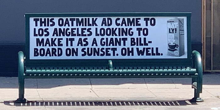
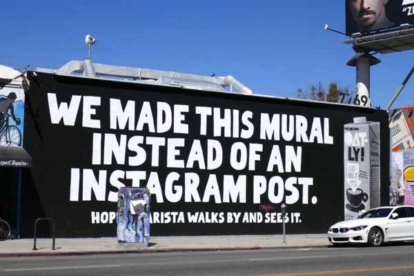
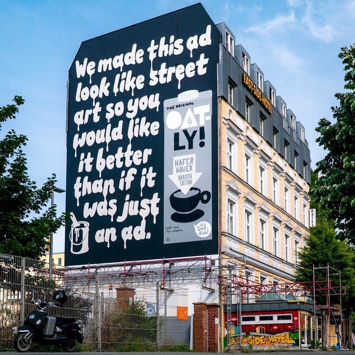
Also Spotify from Who Wot Why. Of course.
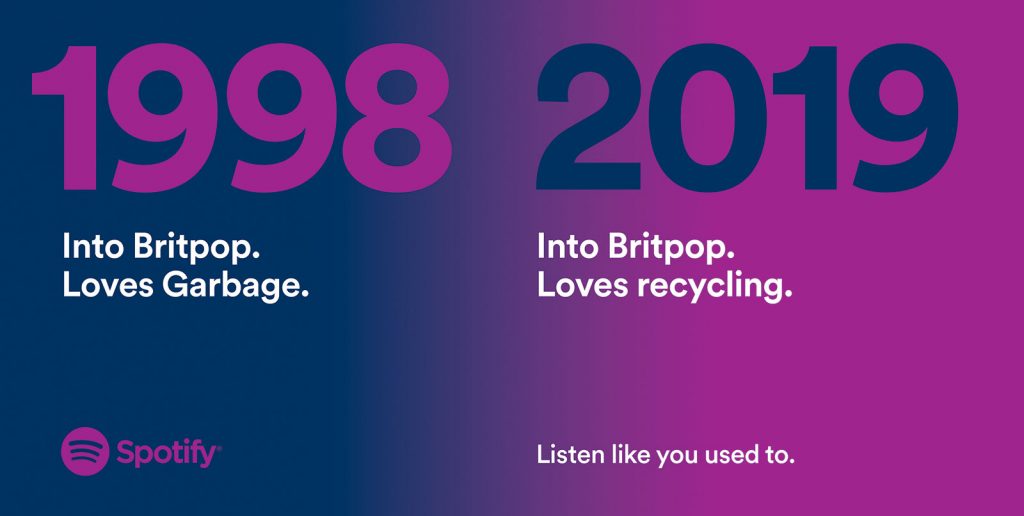
Dave thinks the good Outdoor really stands out, mainly because there’s so much average [and below] work out there. We’re not in a golden age of Outdoor, but there is a nice semi renaissance of good applications of Outdoor.
His first billboard was for Appletiser… 5 points for anyone who can find a pic of it online!
Given this is the Economist special…. We moved quickly onto the enormous body of work, the account and the history of the famous billboards. He talked about the pressure he felt taking on the client given the rich history of award winning work… but the need to help it evolve and to get his stamp on the work to ‘push it on a bit’.
One of the first things Dave implemented was opening the creative process to the teams… no more creative direction behind closed doors. Dave brought in ‘the wall’ – where work would go up… and teams could come in and see where the work was and help push it on.
Briefs from the Economist came in each quarter… but to Dave the briefs seamed quite similar: Read it, get more intelligent. The responses to brief were open to the entire agency. Top to bottom.
When Dave came in there was around 4 campaigns a year and it had been running for 10 years. Fag packet maths said there would have been over 8000 concepts seen, with 320 sold over the 10 years. Creatively Dave felt it needed a kick.
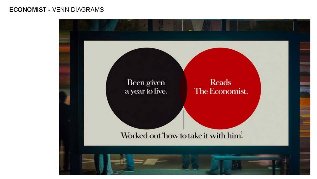
One of the first posters we talked about was the Venn diagram, the first campaign since taking over the Economist responsibility. Inspired by a Vanity Fair piece that featured a Venn diagram, and Dave thought it looked like an Economist ad. The plan was to do 8 in this style for the campaign. Dave likened the writing of the ads to some sort of Mensa test.
Unfortunately the CEO Andrew Robertson [and as it turns out ‘King of the Pun’] came in at the 11th hour and said it couldn’t run for all 8 elements of the campaign. Mainly out of respect for AMV founder David Abbott, and the fact that his ‘Red Campaign’ was his ‘parting gift to the agency’.
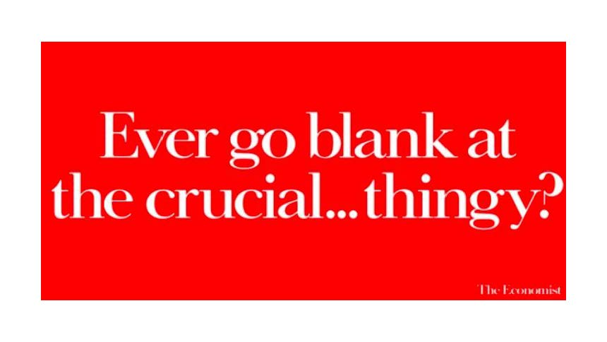
We moved on to the Too Many words example. A bottom drawer idea that was held back and got in eventually following some extra direction… and won a Gold at Campaign the following year.
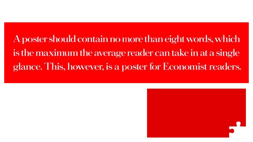
We also talked about the Jigsaw creative. For weeks Dave walked around the teams trying to find out who’s mockup had landed on his desk. Dave had done some development on the concept and worked it up into the full idea…. But he couldn’t locate the initial scamp artist. Eventually Matthew Abbott scuttled in and saw it worked up… ‘Oh you liked it then’.
Something we’ve spoken about before on the show is a piece of work for reception showing the ‘Funnel’ of work through from ideation to delivery on the Economist.
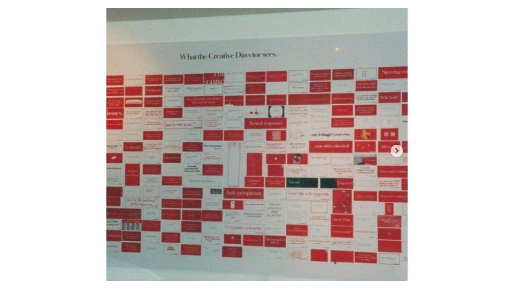
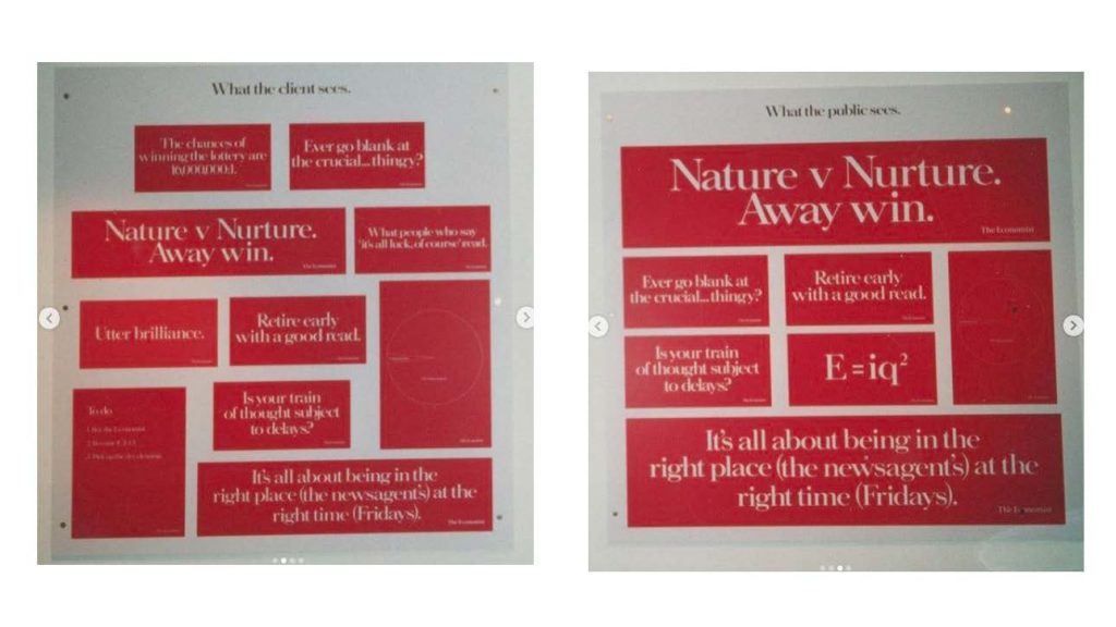
We wrapped up on the Economist with some of the work post Dave and we talked about how it’s changed over the years.
Thanks so much Dave for your fascinating insight into the work. And for Dave Dye fans out there wanting to hear more about his other Billboard work – Adidas, Adnams and Merrydown among others – we will be doing a Dave Dye part 2 later in the year.
So we’re running a competition for you listeners out there to guess what you think Dave’s top Billboard campaign of all time is. Comment on our social and the winner will win a signed copy of Mark Danton’s book. [Hugh’s copy – he’s gonna buy another one].
#behindthebillboard #outdoor #ooh #posters #billboards #theeconomist #amvbbdo

